Burgundy is one of those colors that instantly adds elegance. It’s warm, grounded, slightly dramatic. But used wrong, it can feel heavy fast.
Therefore, the key is restraint. Burgundy works best when it’s placed where it can create contrast and mood without dominating the space.
We show you how to add burgundy interior details the right way.
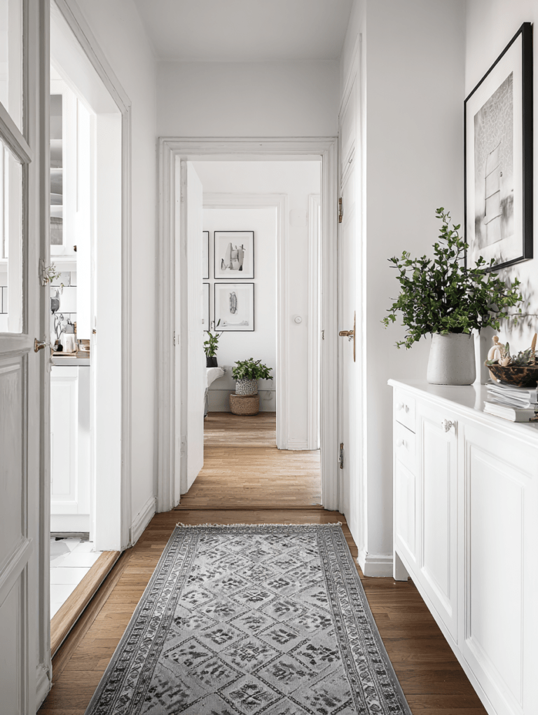
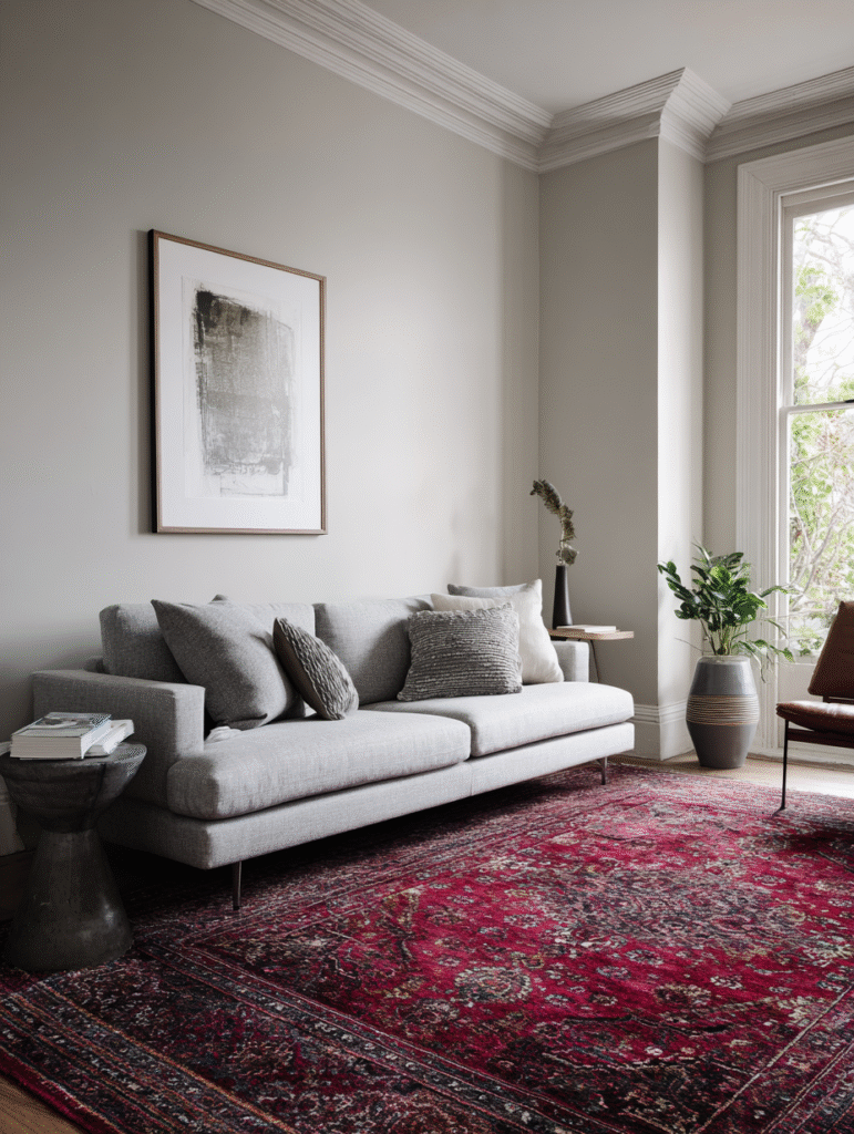
Start With a Rug That Does the Work for You
If you want impact without commitment, start from the floor.
A rug with burgundy details – not fully burgundy – instantly anchors a neutral room. Cream base with deep red pattern. Faded oriental with wine accents. Even subtle woven lines can change the entire atmosphere.
If you’re braver, a burgundy oriental rug* can be the statement. But then keep the rest quiet. Let it breathe. No competing colors, no overly busy furniture.
The rule: if the rug is strong, everything else supports.
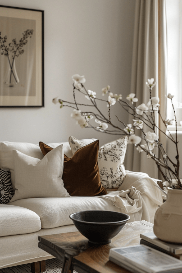
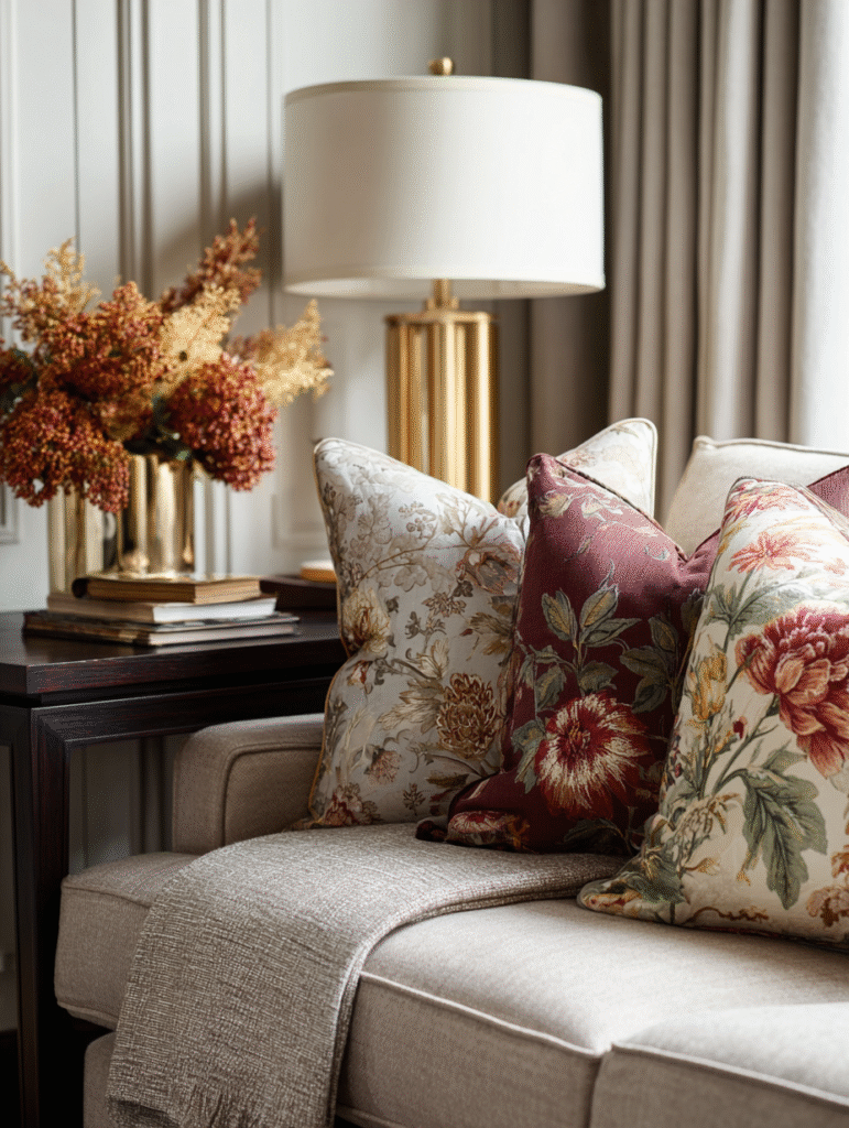
Use Textiles for Controlled Depth
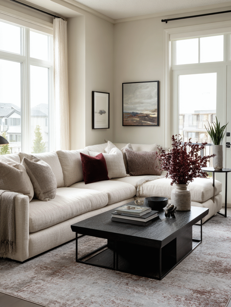
Throw pillows are the safest entry point – but they still need to be placed the right way.
Instead of random burgundy pillows thrown onto a beige sofa, think composition. Pair burgundy with warm neutrals, dark wood, brushed metal. Mix matte fabrics with subtle texture. Linen, velvet, woven cotton.
And don’t overdo it. Two or three well-placed cushions can shift the mood more effectively than ten scattered ones.
Editor’s choice: These round burgundy pillows* elevate your sofa design immediately.
Consider a Contrast Wall – Not a Full Room
Painting an entire room burgundy is a commitment. In a space where you relax daily, it can feel enclosing.
A single accent wall, however, can be powerful – especially in transitional areas like an entryway, hallway, or even behind open kitchen shelving. And because you’re not surrounded by it all day, it doesn’t overwhelm.
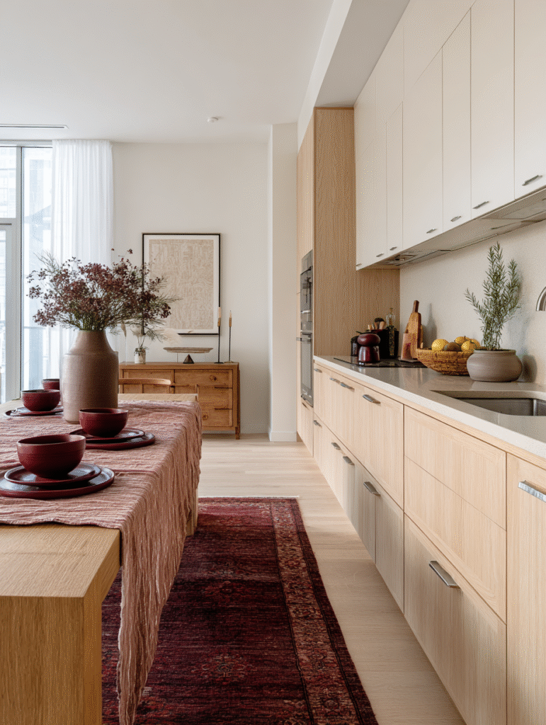
Burgundy in the Kitchen? Keep It Subtle
The kitchen is not where you want visual heaviness.
Instead of cabinetry, think smaller: a runner with burgundy detail*, ceramic bowls with deep red glaze*, a few wine-toned kitchen textiles*.
Even something as simple as a burgundy-toned fruit bowl or bar stools with subtle stitching can introduce warmth without darkening the room.
The goal is contrast, not saturation.
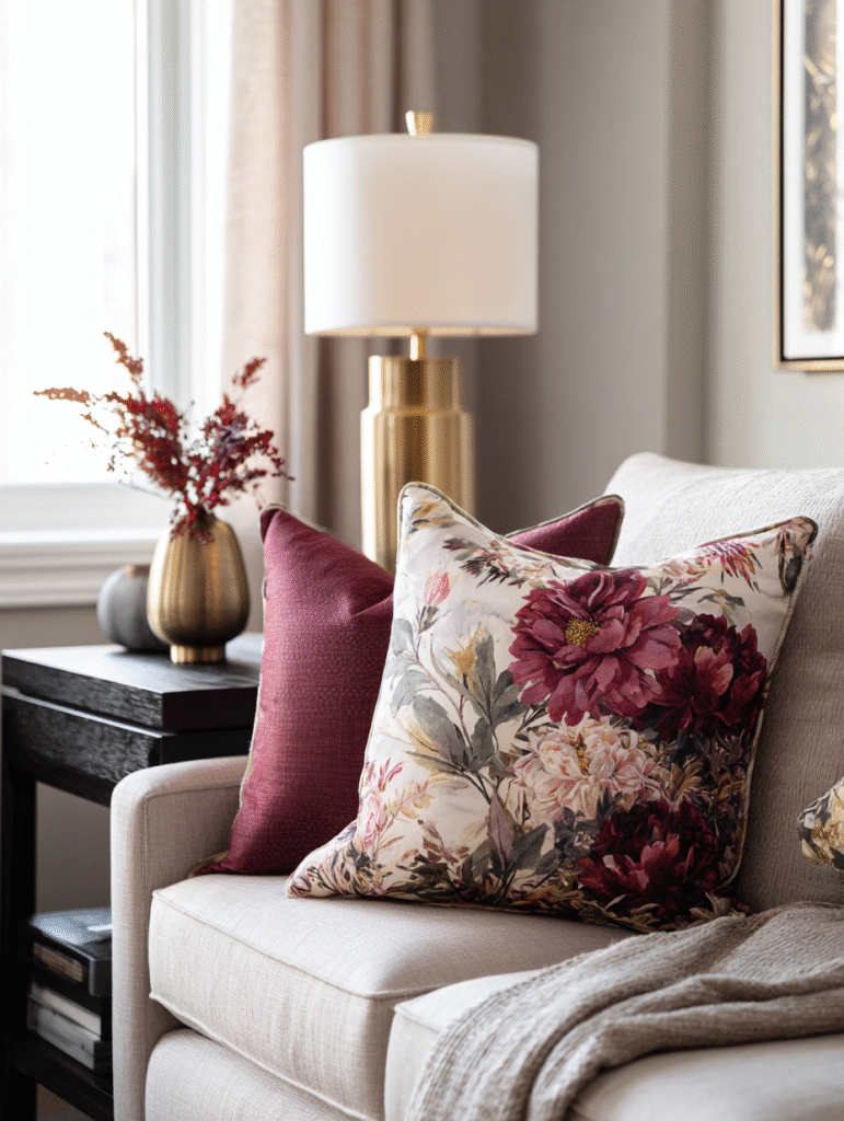
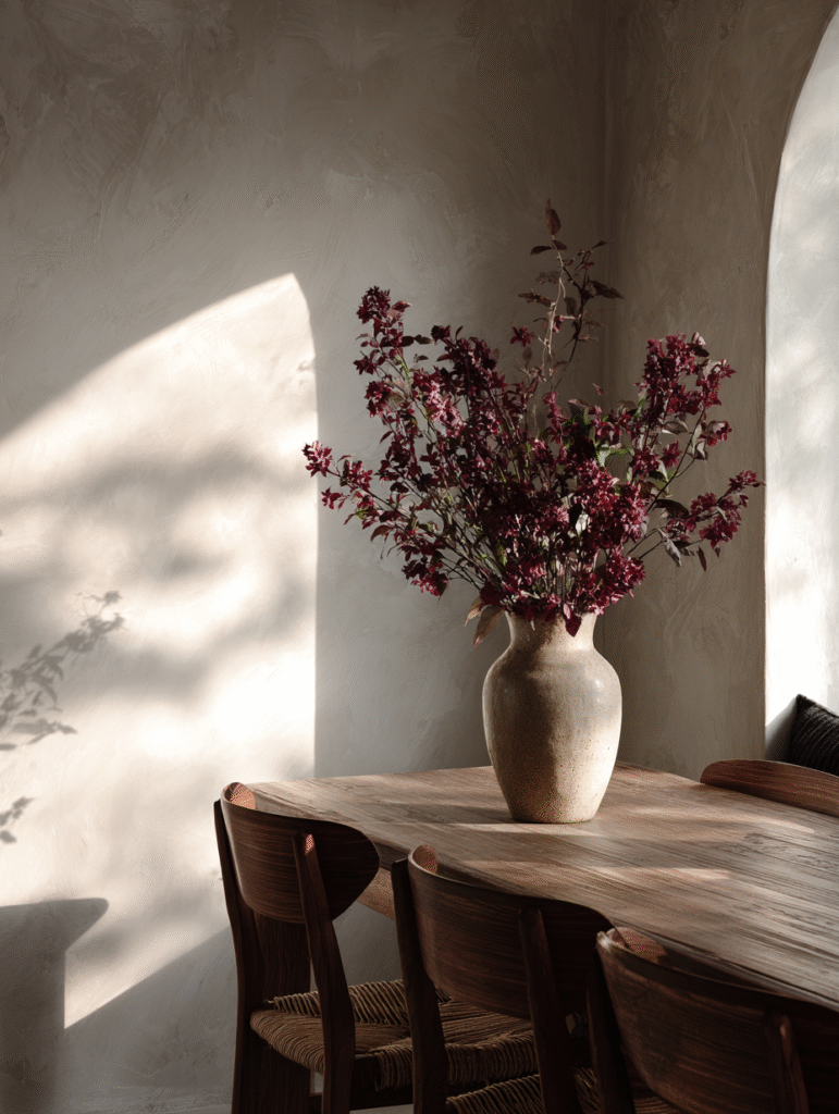
Florals and Greenery in Burgundy
Fresh or dried flowers in deep red tones instantly soften the color.
Burgundy florals* feel rich without being loud. They pair beautifully with olive branches, eucalyptus, or neutral ceramic vases. The organic shape balances the intensity of the color.
It’s an easy seasonal update that doesn’t require permanent changes.
Where Burgundy Works Best
If you love the drama but aren’t sure about commitment, place it in areas where you don’t linger for hours.
Entryways. Transitional spaces. Dining areas used occasionally. Even guest bathrooms.
These zones benefit from boldness because they’re experienced in movement.
Burgundy shouldn’t take over to make a statement. In fact, it’s stronger when it doesn’t. The secret therefore isn’t more color. It’s better placement.